Data visualization is so important when we’re presenting to our team, our board of directors, a boss, and colleagues. We’ve all had the moment where we have spent hours or days prepping for a presentation, think that we are absolutely killing it – only to have the presentation fall flat.
“Why isn’t anyone asking questions???? Or even saying anything at all??
Maybe your presentation consisted of black words on a white background. Times new roman. Stock images. Yep – your presentation needs an upgrade.
As someone who gets excited about data and numbers, I’ve experienced that moment where I show a colleague a spreadsheet that I could swear is the best I’ve ever created, only to experience a huge letdown when they don’t understand the excitement. To them, it’s just numbers on a table. I learned pretty quickly to invest my time and energy into learning how to use visuals to demonstrate my points of interest. And here’s a few reasons why you should too.
Save yourself and the reader some time.
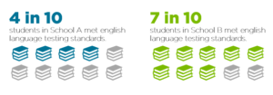
First of all, it takes less time (for you and the reader) to create and understand a simple visual than it does to read a report full of words. For example, you might spend 20 minutes carefully crafting a narrative about differences in English language testing scores between two schools, when instead, you could have created a visual like this:
Capture (and keep) the attention of the reader.
A carefully crafted visual will quickly grab the attention of the reader and will allow them to process the information before you lose their attention again. A study by Microsoft has claimed that the average attention span is only 8 seconds long. If that’s true, then the reader isn’t going to finish reading a paragraph before they lose attention. It takes less time to process an image than it does to read text.
Help the reader remember the information long-term.
There’s a lot of background information that goes into this topic, and it’s too much to get into today (see: the entire Cognitive Psychology lecture I painstakingly suffered through during my undergraduate years). Research on our working memory shows that we have a better long-term memory for things that had an excellent visual and very few words and not a paragraph of text. It doesn’t matter how well-explained or thought out the text was – the visual is a better tool to recall the information.
Visuals inspire action more often than a simple bullet point.
- In 2018, 16% of children lived in poverty. This is much higher than the poverty rate of adults which is 11%, or roughly one in ten.
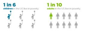
If we first direct our attention to the bullet point of text, it is quite boring and doesn’t inspire me to act. BUT – if we look at the two visuals, we can see that the poverty rate is much higher among children than adults, and warrants our attention and action. This is a quick and easy method to really pack a punch.
So, in 2021, I encourage you to think about how you can creatively introduce visuals into your reports and presentations. Will I be using them more and working to increase my efficacy? 100%.